
Five easy fixes for common Squarespace oversights
Hello there fellow Squarespacer!
While I spend most of my time building custom-designed Squarespace websites for clients, I also do a lot of work with business owners who have already set up their sites and want me to check things over for them and tie up any loose ends.
After handling a lot of these projects lately, I’ve noticed some common hiccups that are super easy to fix. So, if you’re doing it yourself, have a look through the list and give your site a spruce!
Favicons: tiny yet mighty
If you still have the default Squarespace grey cube as your favicon, it is time for an upgrade! Trust me, it only takes a second to change and your website will instantly look one billion times more professional.
Favicons aren’t just embellishments, but also make it easier for users to identify your site among tabs, and appear next to your site title on search engines, giving you an extra opportunity to stand out from the crowd in search results.
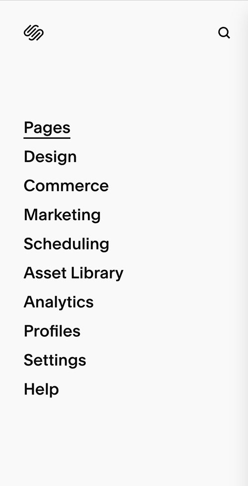
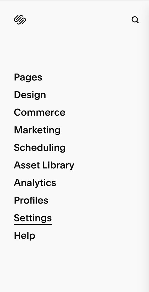
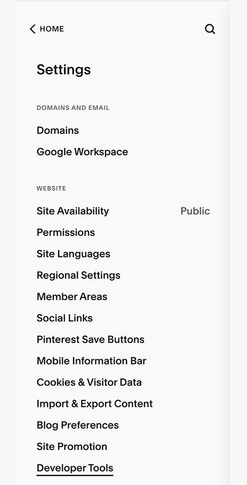
To add your favicon go:

Et voila! If you don’t have a logo variation for your favicon, no problem! Just use the first letter of your business name in your brand font and colours. Easy peasy!
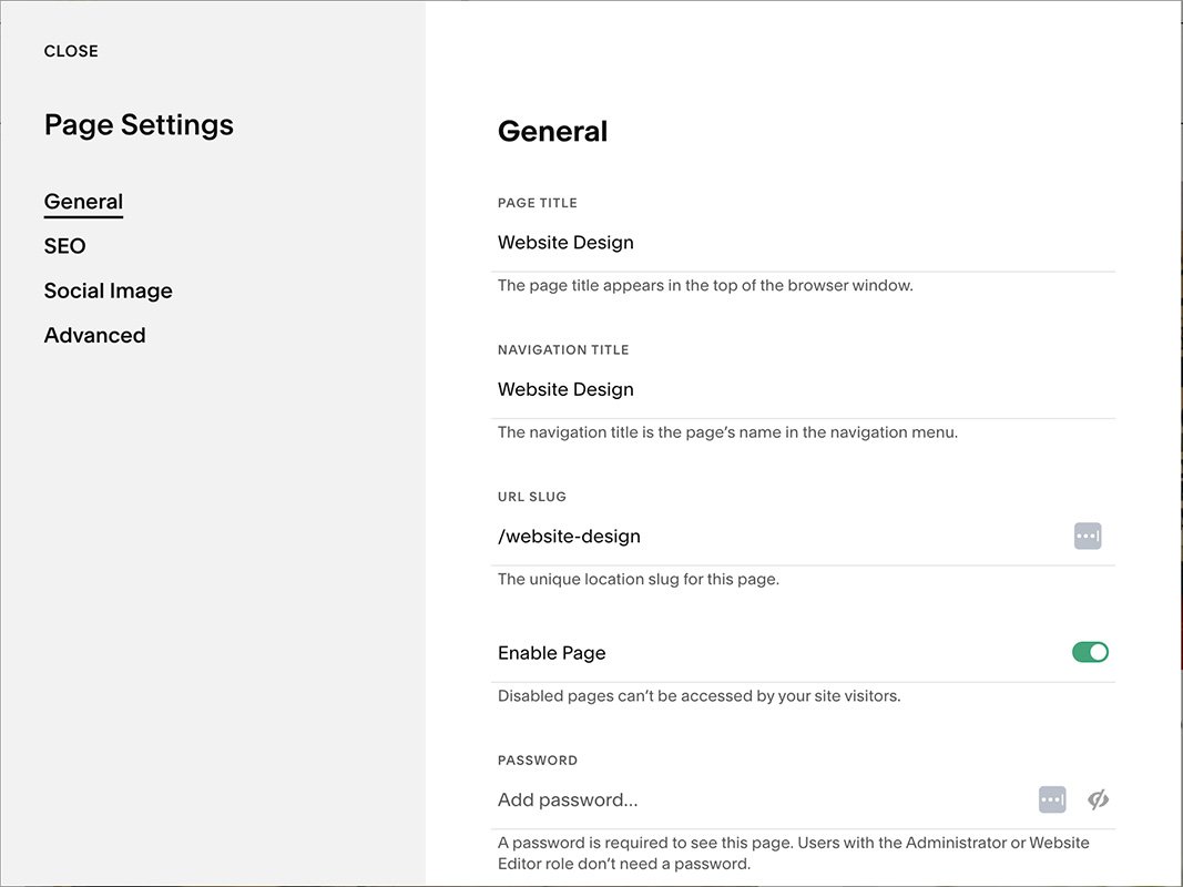
2. A URL slug by any other name would not smell quite as good
If you’ve been duplicating pages as you’ve been redrafting them, chances are you’ve been left with a not so pretty url structure like /blog1, /blog2, /blog3… Nobody wants to be stuck on /blog3 when /blog is clearly where the party’s at.
BUT if you’ve been getting a lot of traffic to your page, you don’t want to throw the baby out with the /blog3 bathwater. So I would also recommend updating the redirects. This is a bit trickier, but really good if you were hoping to keep riding your SEO wave. Just go:

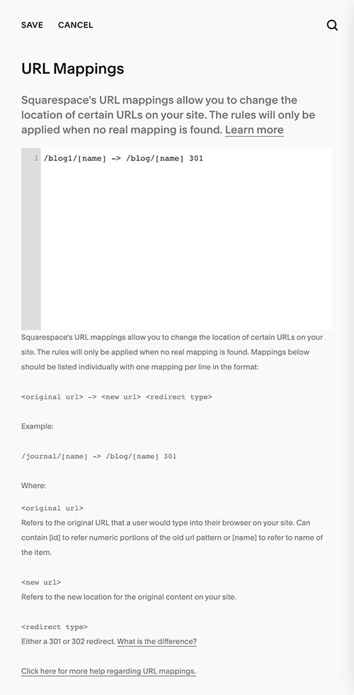
In most cases, you’ll want something like: /blog1 -> /blog 301, but in this blog example you’ll also want the POSTS to redirect so you’d have /blog1/[name] -> /blog/[name] 301.
Read the below to find out all of the other possibilities:
https://support.squarespace.com/hc/en-us/articles/205815308
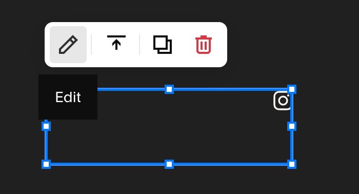
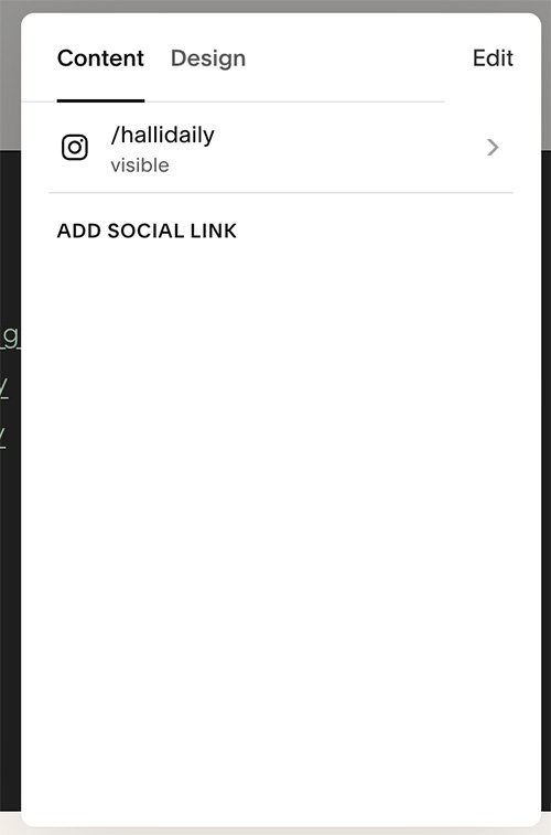
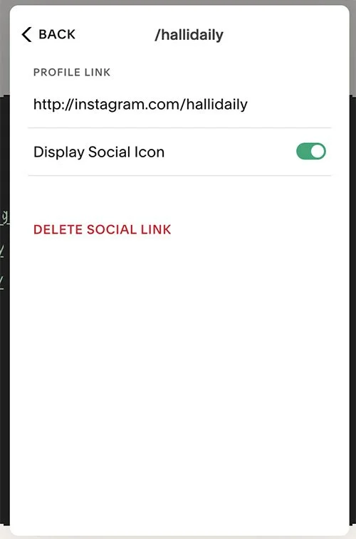
3. Social links: not just for show
When people start with a template, it usually comes with pre-filled social links, often leading to Squarespace's social media accounts. When I'm browsing for services, I like to snoop on their social media accounts to get a sense of their vibe. If they seem cool, I tend to follow them, which helps me remember and get to know them as a business. Who knows, I might even become their customer someday!
So, updating your social links is super important for building lasting relationships with your audience. Don't miss out on this opportunity to make a genuine connection!
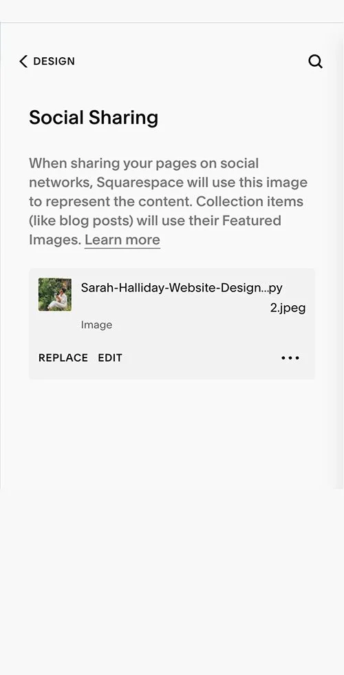
4. The elusive social sharing image
I’m going to level with you, this one took me ages to figure out. They don’t make it obvious!
The social sharing image is the image that is automatically added to the link when you share your site. This could be on twitter, Facebook and even on Whatsapp. Squarespace automatically uses your logo for this, which is cool unless your logo is very tiny, or white on a transparent background, or just not the thing that you want to be showing up when you post your site somewhere.
If you’re not sure what to use as your social sharing image, I suggest using your hero image, like so:
5. Headings: more than a Pretty Font Face!
Okay, this is a biggie, which is why I’ve saved it ‘till last.
If you're starting out, you might think Squarespace's heading options (h1, h2, h3, and h4) are merely for changing text sizes. Not so! They play a crucial role in both SEO and accessibility, making them way more than just eye candy.
For SEO, these headings help search engines like Google grasp the main idea of your page's content. And when it comes to accessibility, they help users who rely on screen readers or similar tools to navigate your website.
Here's the golden rule: Stick to one H1 per page, summing up what that page is all about. H2s come next, serving as subheadings under the main H1. Then, we've got H3s and H4s for additional levels of subheadings.
It’s kind of hard to explain, so to make it all crystal clear, I like to use the ‘Menu’ example:
H1: Our Menu
H2: Drinks
H3: Hot Drinks
Coffee
Hot Chocolate
H3: Alcoholic drinks
Beer
Wine
H2: Starters
H3: Soups
Tomato Soup
Mushroom Soup
H3: Salads
Caesar Salad
Waldorf Salad
I think the menu example really helps you visualise how you need to be structuring your copy and understand how your target customer is going to use headings to better understand your copy. If you are sitting down at a restaurant, and you know you want to buy a beer, you’d skim-read all the titles and head on over to the drinks section. Likewise, your customer might be accessing your homepage to learn more about you as a company, so would skim over until they found an ‘About’ heading.
Now, you might wonder, "What if I want big text that doesn't fit into my text structure?" Fear not! CSS can save you by letting you style paragraph text just like your headings. Voila! A harmonious blend of style and substance! I appreciate that this may be a bit advanced, but if it’s something you’re interested in, reach out and I’ll help you out!
I hope these tips were helpful! If you ever find yourself in need of additional help or have any questions, don't hesitate to reach out. hello@sarahhalliday.com
Fancy giving me a little kickback? I’m a Squarespace Circle member, which means I will receive a commission on any purchase you make through my Squarespace affiliate links. Thank you, my friend!